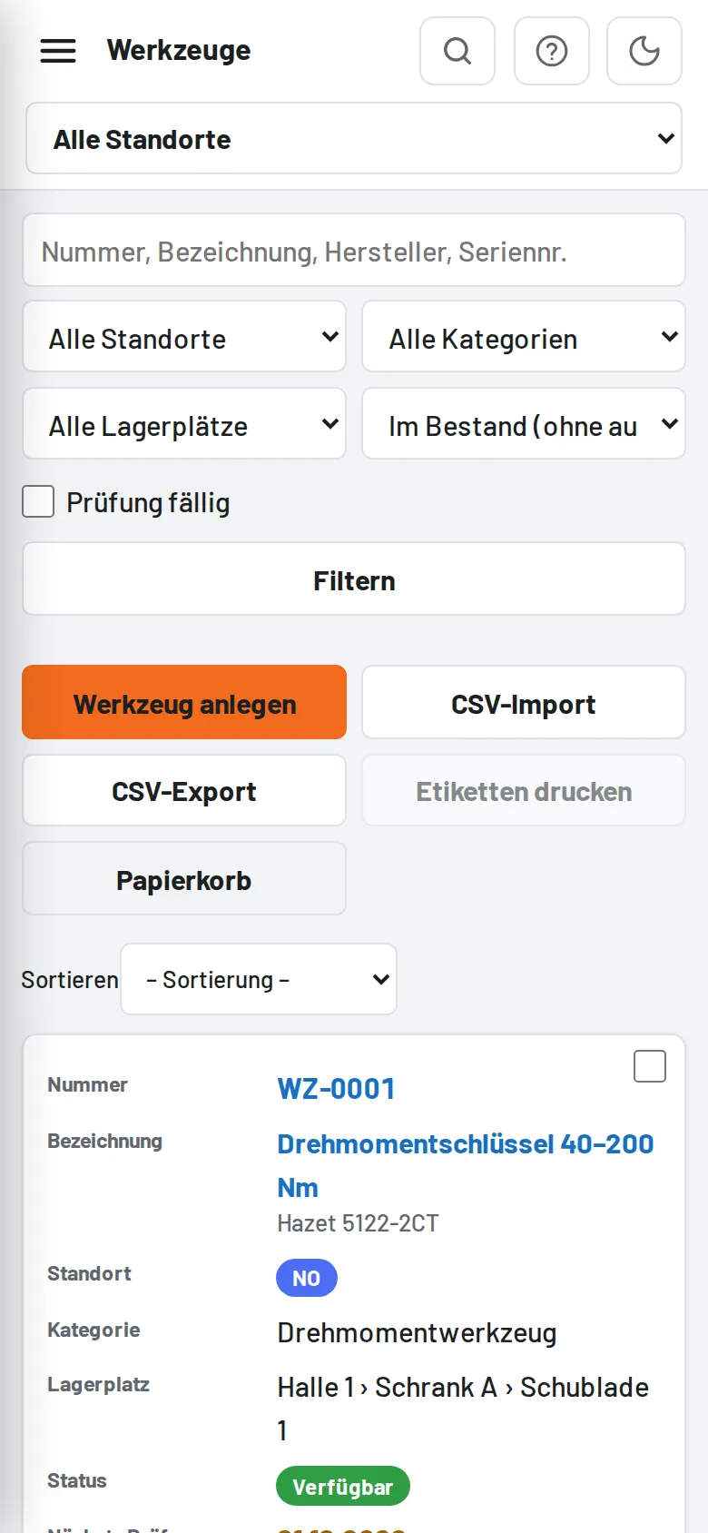
Below a width of 640 px all tables become cards: each row a card, each column as "Name: value", the selection box at the top right, the buttons in a row below. The sort order appears as a dropdown above the list. Columns hidden at medium widths (category, storage location, IP …) are back in the card view.
The permission matrix under Users remains a table and can be scrolled sideways.
The sidebar is divided into sections (Tools, Loans, Reports, Administration); tapping the heading collapses or expands the section, and the choice is saved per device. With long menus (administrator) only Overview and the section of the current page are open at first.
Between 900 and 1180 px (tablet in landscape, small monitors) the sidebar only shows icons, sections are separated by lines and always open; the name appears when you tap or hover, the profile as a circle with initials.
On the phone the header search is behind the magnifying glass (it opens its own row with a camera button); suggestions appear below across the full width, and a tap opens the tool. On long forms the bar with Save/Cancel stays visible at the bottom.
Input fields are 16 px (no automatic zooming on the iPhone), buttons at least 44 px high; the home screen app respects the notch and home bar.
Only necessary cookies. Tulz only stores what is needed for sign-in, security and your settings – no tracking, no advertising, no third-party content. Details in the privacy policy